MailUp Blog

We are aware that sales hinge on appreciation, trust, and a strong brand-consumer relationship, nothing new there. What’s more challengi...

Think about how many customer and prospect email addresses you have in your lists ending in “@gmail.com” or “@yahoo.com”. A lot, right?
...
With 4 billion users using email every day and an 8.7% increase in mailings since 2020, Email Marketing has become the marketing chann...
After many years, email maintains its position as the digital channel with the highest ROI. Here you’ll find everything, absolutely everything you need to know about Email Marketing, from design to personalization, from automation to performance analysis.


make sure you have a secure and reliable email mailing tool that protects you from dangerous and inval...
Think about how many customer and prospect email addresses you have in your lists ending in “@gmail.com” or “@yahoo.com”. A lot, right?
...
Thus we offer you this blog post, where we have put together all the missteps and mistakes that marketers can make when manag...

From developing integrations to providing strategic support, from creating creative concepts to optimizing results.
All the latest news from the MailUp world: from the new features of the platform to events, from the latest ebooks to Email and Digital Marketing news.


But there are a number of intermediate steps you must be sure to carry out in order to get there, and some metrics that deserve your attention...

Data-driven marketing is growing at a global level, with data at the base of any successful marketing decision or strategy. A...

What’s more, Apple was turning a higher profit off the app store than it ever had, and the Android ecosystem...
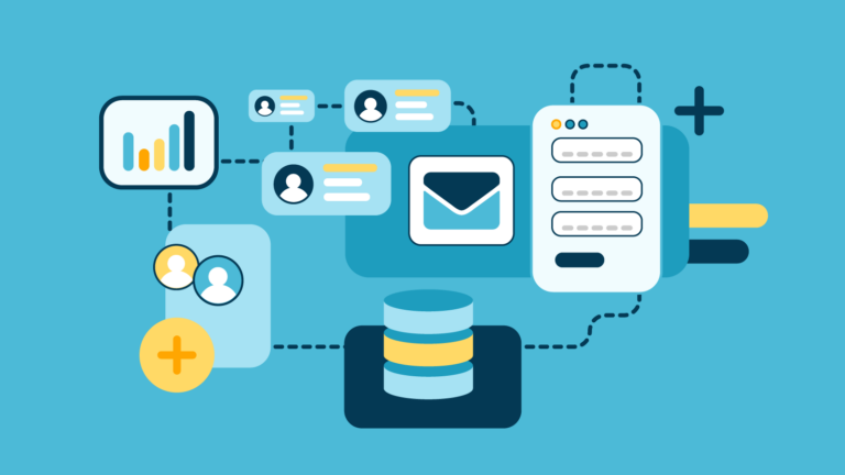
Doing Marketing Automation means being able to reach the right recipient at the right time with relevant, high-converting messages. It’s a strategic choice that’s now essential for any marketer.


We are aware that sales hinge on appreciation, trust, and a strong brand-consumer relationship, nothing new there. What’s more challengi...
Among the ten commandments for building...
With 4 billion users using email every day and an 8.7% increase in mailings since 2020, Email Marketing has become the marketing chann...
According to Hubspot,...
If you do email marketing, you definitely spend a large part of your day on email campaigns, often performing repetitive tasks that do...
When we talk about Market...
Blog and website managers are becoming obsessed with ...
Email scams that rely on sender forgery, like spoofing and phishing, have been around since the mid-1990s. However, they’ve g...
Think about how many customer and prospect email addresses you have in your lists ending in “@gmail.com” or “@yahoo.com”. A lot, right?
...The festivities are just around the corner and it’s time to take stock of the year about to end before leaving for the Christmas break.
...